W.04 — DESIGN STUDY · FINTECH · PAYMENT OPERATIONS

DROWNING THE PEOPLE MEANT TO TRIAGE THEM.

Payment operations dashboards are drowning the people meant to triage them. A sector study on how payment ops platforms could surface disputes, reconciliation exceptions, and team performance for analysts, operators, and managers in a single role-aware system. Grounded in published industry research.

Payment operations platform UX design — dispute queue, reconciliation, and chargeback ratio dashboards

01 — THE CORE TENSION

BURIED IN ALERTS, THEN JUDGED ON THE CASES THEY MISS.

Global chargeback volume is projected to reach 337 million transactions by 2028, costing merchants over $40 billion annually. Behind every one of those numbers is an analyst on a queue. According to ACAMS, 67% of fraud and AML analysts report moderate to severe burnout, with alert volume cited as the leading cause. Average fraud analyst tenure is now 2.1 years, compared to 3.8 years for other risk roles in financial institutions.

The problem is not detection. Detection is working. The problem is what happens after detection. Fraud teams operate with false positive rates of 90 to 95%, which means analysts spend the majority of their working hours investigating transactions that turn out to be legitimate. They clear 80 plus alerts per shift, and genuine fraud accounts for less than 2% of total volume.

The dashboards meant to help them have not kept pace. Analysts move between five to ten separate tools to investigate a single case. Asana's Anatomy of Work Index found knowledge workers switch between apps 25 times per day. UC Irvine research established that it takes 23 minutes and 15 seconds to fully regain focus after a significant interruption. Payment operations is the sector where this cost is the most expensive, and the least talked about.
02 — THE CHALLENGES

THREE CHALLENGES THIS STUDY SET OUT TO SOLVE.

01

ONE PLATFORM, THREE ROLES, THREE DIFFERENT JOBS.

Analysts investigate disputes. Operators process payment exceptions and reconcile transactions. Managers monitor team performance, win rates, and chargeback ratios against card network thresholds. Every existing platform tries to serve all three through a single generic dashboard. The result is everyone seeing what no one specifically needs.

02

TRIAGE OVER DISPLAY. LESS DATA, RANKED.

An analyst seeing 200 alerts in their queue does not need a fancier chart. They need the queue ranked by severity, by deadline, by recovery value. The hardest design decision in this study was deciding what to remove from the analyst's default view, not what to add.

03

BUILDING TRUST IN A SYSTEM THAT AFFECTS REAL MONEY.

Every action in this product moves a number on a balance sheet. Every wrong action creates regulatory exposure or customer churn. The design needs to communicate confidence where confidence is earned, uncertainty where it is real, and irreversibility where actions cannot be undone. Approval workflows, audit trails, and least-privilege access are first-class design decisions in this sector.

03 — RESEARCH FOUNDATION

WHAT THE RESEARCH SAID. BEFORE ANY SCREEN WAS DRAWN.

This study began with two weeks of desk research. I read every public industry report I could find on payment operations: the Mastercard State of Chargebacks Report, the Chargebacks911 Field Report, Datos Insights data on first-party fraud, Cybersource's Global Fraud Report, and ACAMS' analyst survey on burnout. I studied the dispute management interfaces of Stripe, Adyen, Modern Treasury, Trovata, Tesorio, HighRadius, Sift, and Chargeflow. The patterns are clear once you look at enough of them.

Source
Finding
Implication for design
Mastercard, 2025
Global chargeback volume reaching 337M by 2028, costing $41.69B
Volume problem first, accuracy problem second
Gartner, 2025
Fraud detection false positive rate of 90 to 95%
Alert ranking and explanation matters more than alert generation
ACAMS, 2025
67% of analysts report burnout, 2.1 year average tenure
Tooling is a retention problem, not just a productivity problem
PwC Global Finance Survey
30 to 40% of finance team time on transactional work
Automation visibility, not just automation, is the unlock
Stripe, Smart Disputes case study
GitHub Sponsors saved 20 hours per month on dispute review with AI assistance
AI assistance works when the human sees the reasoning, not just the output
Tesorio customer case
Cut analyst time on lower-priority accounts from 25% of the week to under 2 hours weekly
Surface the few accounts that matter, hide the rest until needed
UC Irvine, workplace interruptions research
23 minutes 15 seconds to regain focus after interruption
In-context investigation, not tab-hopping between tools

04 — THE FRAMEWORK

FOUR PRINCIPLES EVERY SCREEN HAD TO DEFEND.

01

ROLE FIRST, FEATURE SECOND

An analyst clearing a dispute queue and a manager reviewing win rates make different decisions and need different data. Designing for the role, not the feature, is what separates a database with a UI from a tool the team trusts.

02

TRIAGE OVER DISPLAY

When the queue has 200 alerts, the win is not more dashboards. It is a system that points at the few that need attention right now. Defaults should hide more than they show.

03

REASONING OVER FLAGS

A risk badge without the why is just another thing to interpret. Every flag explains itself in plain language: which rule fired, what the threshold was, what the data is asking for.

04

REVERSIBILITY SHAPES CONFIDENCE

Irreversible actions — accepting a chargeback, releasing funds — get confirmation modals, audit logs, and reversible-by-default policies where possible. Reversible actions get fast paths. The design treats the two differently.

05 — SCOPE

WHAT THIS STUDY COVERED. WHAT IT DID NOT.

Real payment operations platforms have surfaces that take years to design well. This study scoped to the core triage and resolution loop. Anything outside that loop was deliberately excluded so the work could go deep rather than wide.

IN SCOPE
  • Three role-based dashboards (Analyst, Operator, Manager)
  • Dispute queue with ranked prioritization
  • Single dispute investigation view with evidence assembly
  • Reconciliation exception queue for the operator role
  • Manager view: chargeback rate, win rate, team load, card network monitoring program thresholds
  • A role permission matrix
  • A token architecture diagram for the design system
OUT OF SCOPE
  • Onboarding flows
  • Settings and configuration screens
  • Mobile design beyond responsive principles
  • Integrations and API documentation
  • Customer-facing dispute response forms
  • Reporting and export workflows
  • Localization beyond English

06 — THE ROLES

THREE ROLES. THREE VIEWS. ONE SYSTEM.

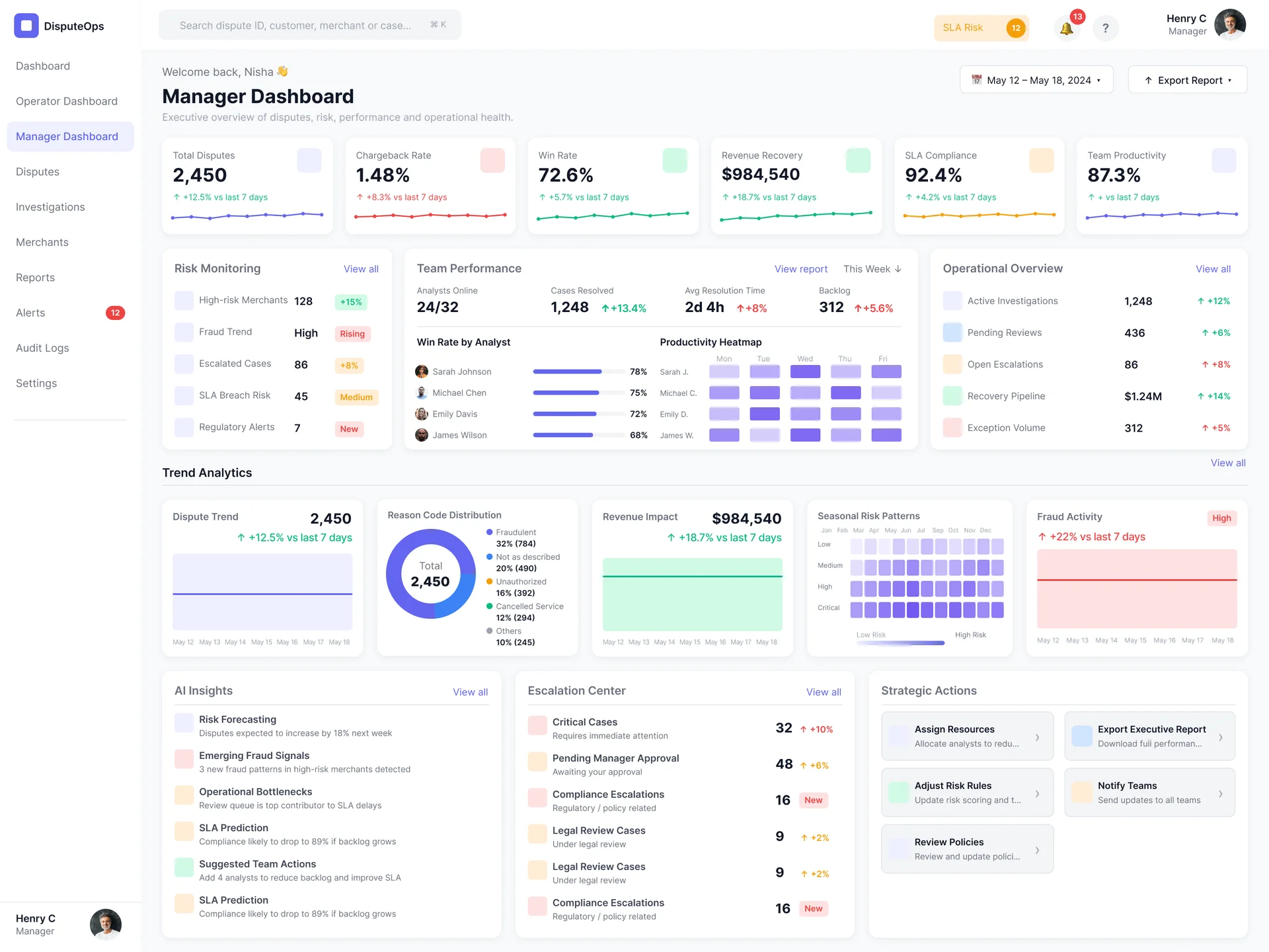
Most payment operations platforms ship one dashboard and hope role-based filtering does the rest. This study split the product into three role-specific dashboards built on a shared data layer. Each one answers the question that role asks first thing in the morning.

ANALYST

Primary question: Which disputes do I work first?

Primary action: Investigate, gather evidence, submit representment.

METRIC — QUEUE CLEARED, WIN RATE ON SUBMITTED CASES

OPERATOR

Primary question: What is broken that needs my attention?

Primary action: Resolve reconciliation exceptions, process exception payments, clear unmatched transactions.

METRIC — EXCEPTION QUEUE, TIME-TO-MATCH, UNMATCHED DOLLARS

MANAGER

Primary question: Is the team keeping pace, and are we close to any monitoring thresholds?

Primary action: Monitor team load, win rates, chargeback ratios against VAMP and Visa Dispute Monitoring Program thresholds.

METRIC — CHARGEBACK RATE, DISPUTE COUNT, TEAM UTILIZATION

07 — KEY DECISIONS

FIVE DECISIONS, FIVE FORKS, FIVE CALLS THIS STUDY WOULD DEFEND.

01

THREE ROLE-BASED DASHBOARDS, NOT ONE CONFIGURABLE VIEW

What I considered

A single dashboard with role-based default widgets and a customization layer. This is the path most platforms take.

What I chose

Three distinct dashboards, hardcoded to the role. Customization within each, not across them.

Why

Configurability is not a substitute for defaults. Enterprise buyers want to know they will not have to build the product themselves. Opinionated defaults signal that you understand their workflow. The cost of three views is one-time. The cost of a generic everything-view compounds every onboarding.

02

QUEUE FIRST, DASHBOARD SECOND

What I considered

Open analysts to a dashboard with KPI cards across the top, queue below.

What I chose

Open analysts directly into their ranked queue. Move KPI cards to a collapsed panel or a separate analytics surface.

Why

Analysts do not come to the product for KPIs. They come to work the queue. The team's chargeback rate matters to the manager. It is noise on the analyst's home page. Cut it from the default.

03

SEVERITY SCORE, NOT SEVERITY COLOR

What I considered

Color-code rows by severity: red, amber, green.

What I chose

Compute a numerical severity score per dispute. Show the score, show its three components, and use color only to reinforce, never to communicate alone.

Why

Color-only severity coding fails accessibility, fails colorblind users, and gives no answer to the analyst question that comes next: why is this high? The score is a number and a sentence. The color is a reinforcement. Triage over display, applied to a single design element.

04

EVIDENCE ASSEMBLED, NOT JUST LISTED

What I considered

Show all available evidence in a structured list, let the analyst download what they need.

What I chose

Pre-assemble an evidence packet per reason code with the documents the card network actually wants for that specific dispute type. Show the assembled packet first. Let the analyst add or remove from there.

Why

Stripe's Smart Disputes shipped this pattern and GitHub Sponsors saved 20 hours per month. The job is not to give the analyst the evidence library. The job is to give them the case prebuilt, then let them adjust. Reasoning beats raw data.

05

MANAGER VIEW EXCLUDES THE QUEUE

What I considered

Give managers a higher-level filter on the analyst queue view.

What I chose

Managers do not see the queue at all by default. They see team performance, monitoring program thresholds, and aggregate metrics. The queue is one click away, not the front door.

Why

Managers asked about the team's worst case will dive in. The default question they actually ask every morning is whether the team is close to any threshold that triggers card network monitoring. The Visa Dispute Monitoring Program puts merchants in probation at 0.9% chargeback ratio. The Visa Acquirer Monitoring Program has its own thresholds. The manager view treats these as the default headline.

08 — THE PRIORITIZATION FRAMEWORK

SUBJECTIVE TRIAGE DOES NOT SURVIVE A REAL TEAM.

The biggest risk in any payment operations platform is that the queue feels arbitrary. Analysts triage based on instinct, managers cannot tell whether the team is working on the right cases, and the platform stops getting trusted. The design needed a defensible ranking that engineering and operations could both sign off on.

I adapted a severity formula used in fraud operations literature. Each component is calculable from data the platform already has. Each component is visible to the analyst. The ranking is the same for every analyst on the team. Managers can see why a case ranked where it did. Engineering can implement it deterministically.

SEVERITY = RECOVERY VALUE × WIN PROBABILITY × DEADLINE WEIGHT

RECOVERY VALUE

Disputed transaction amount in USD. Pulled from the payment record.

WIN PROBABILITY

Historical win rate for this reason code with this evidence set. Computed from the team's last 90 days.

DEADLINE WEIGHT

Curve that scales from 0.5 at 14+ days remaining to 2.0 at 48 hours remaining. Card network deadlines vary by network and reason code.

09 — THE DESIGN SYSTEM

A TOKEN ARCHITECTURE THIS PRODUCT WOULD NEED.

A platform with three role dashboards, dense data tables, and real money on every screen needs a token architecture that scales. The design system for this study uses a three-layer token system: primitive, semantic, component. Primitives never appear in components. Semantic tokens swap to support dark mode and high-contrast modes. Component tokens scope to specific patterns like the severity score, the dispute card, and the reconciliation exception row.

L.01

PRIMITIVE

Raw values, never used directly in components.

color-neutral-900: #0A0A0A
color-red-500: #DC2626
color-green-500: #16A34A
space-4: 16px
font-size-base: 14px

L.02

SEMANTIC

Intent-based aliases. Components reference these.

color-text-primary
color-status-critical
color-status-success
color-surface-card
space-card-padding

L.03

COMPONENT

Scoped to specific UI patterns.

color-severity-score-high
color-dispute-card-border
space-queue-row-vertical

10 — WHAT COMES NEXT

  • Moderated research with payment operations analysts at companies in the $50M to $500M transaction volume range. Test the severity formula component, the role-split decision, and the evidence-assembly pattern. That feedback sharpens the formula before any further design work.
  • A working prototype of the severity score, wired to synthetic data, with an engineering estimate on the compute cost of recalculating per analyst session. The design assumes real-time recomputation. That assumption needs validation against real workload.
  • Deeper work on the reconciliation exception detail view for the operator role. The operator role got the lightest treatment here and deserves its own exploration in a follow-up.

If you are hiring for a senior product designer role in fintech and want to discuss this work or anything in my portfolio, reach me at hey@shahriarsultan.com.