W.01 — KARAZ CARE · HEALTHTECH · ENTERPRISE SAAS

A MULTI-ROLE PLATFORM FOR DIABETES CARE.

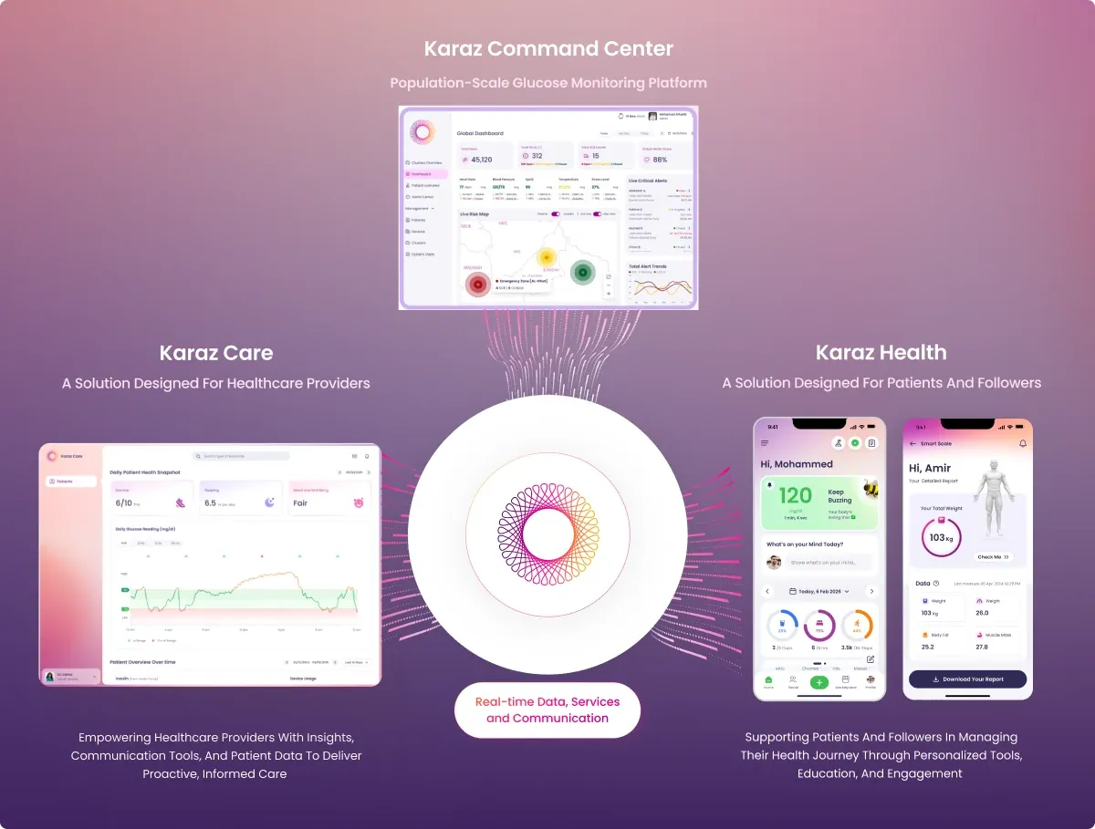
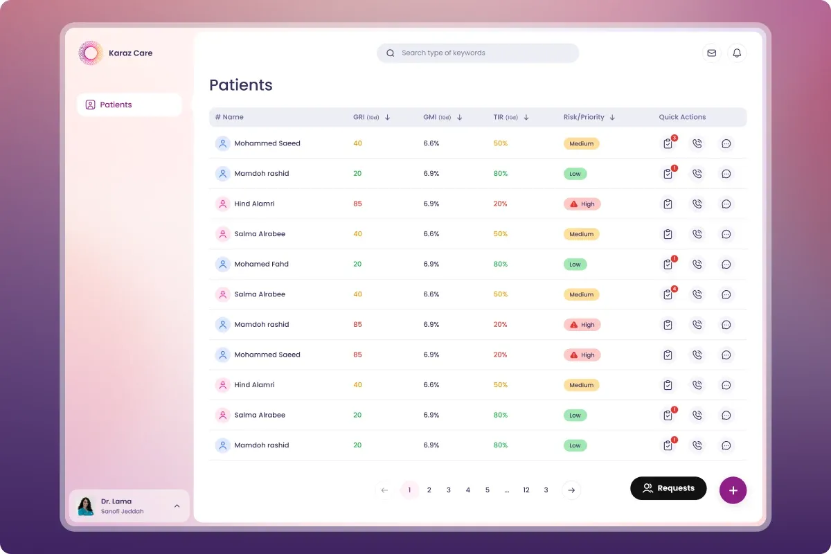
Designed Karaz Care, a multi-role healthcare platform. Live in 13+ countries managing 100K+ patients. I led design end to end — research, information architecture, user flows, wireframes, the design system, and the final UI across five role-based dashboards — and managed two junior designers on the team.

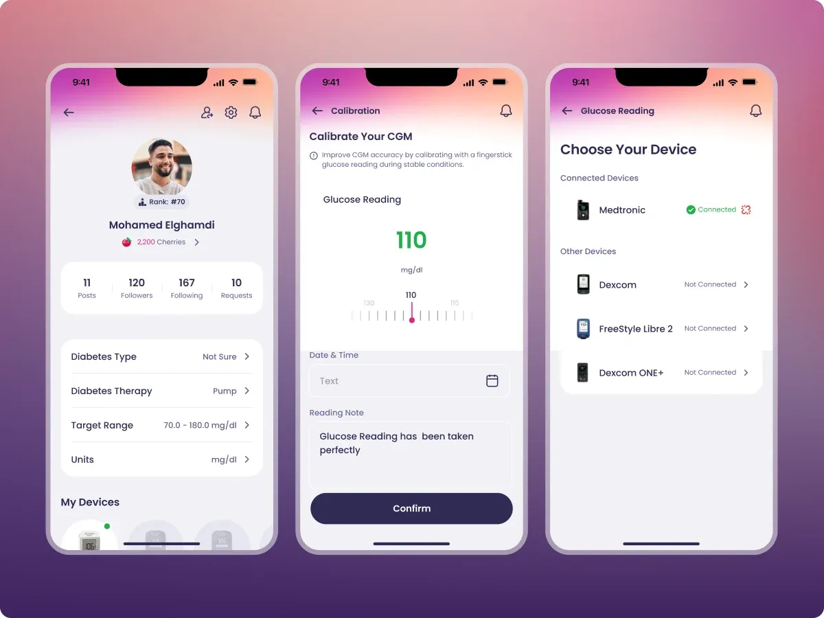
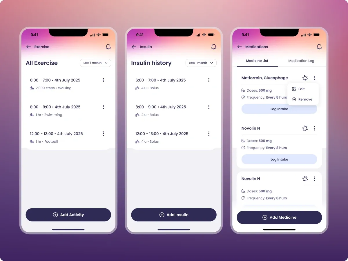
Karaz Care — multi-role healthcare platform hero shot

THE THINKING

FOUR PRINCIPLES I WOULD DEFEND AT EVERY FORK.

Diabetes care touches five different jobs in a clinic. Each role makes different decisions and needs different data. Before designing a single screen, I anchored the platform to four principles. Every fork in the road came back to these.

01

ROLE FIRST, FEATURE SECOND

A receptionist managing waiting rooms and a doctor triaging risk solve different problems. Designing for the role, not the feature, is what turns a database with a UI into software the team trusts.

02

TRIAGE OVER DISPLAY

When clinicians see 100+ patients a day, the win is not more dashboards. It is a system that points at the few that need attention right now.

03

REASONING OVER FLAGS

A risk badge without the why is just another thing to interpret. Every flag explains itself in plain language, with the data that triggered it.

04

SCAN FIRST, DRILL LATER

A patient overview that lists every past lab is no longer an overview. Recent data, then a clear path to the full archive.

SCOPE OF WORK

ONE PLATFORM. FIVE ROLES. SIX MODULES.

Across the entire surface of the product — from research synthesis to design system.

  • Doctor — Triage risk, decide treatment, log interventions.
  • Nurse — Track vitals, log interventions, hand off cleanly.
  • Admin — Run the clinic. Staff, patients, outcomes.
  • Pharmacy — Manage prescriptions, refills, adherence.
  • Receptionist — Waiting list, appointments, referrals.

PATIENT MANAGEMENT

Risk triage, body assessment, glucose curves, AGP charts, full medical history.

CRMS MODULE

CGM device replacement workflow. Sensor lifecycle, replacement queue, courier handoff.

AUTH & MULTI-CLINIC

Role-based access. Doctors at one clinic don't see another clinic's data.

IN-APP CHAT

Clinician-patient and care-team messaging. Threaded by patient, archived for compliance.

NOTIFICATIONS & SCHEDULING

Role-aware alerts and calendar. A doctor sees risk escalations, a receptionist sees check-in delays.

DESIGN SYSTEM

Colors, typography, components, and icons. One library, used by every screen across every role.

THE PROBLEM

TOO MUCH RAW DATA. NO WAY TO TRIAGE.

Diabetes care was reactive and fragmented. Clinicians, nurses, receptionists, pharmacy staff, and admins all worked in separate tools. Patient data was stuck in handwritten logs and scattered reports. Karaz needed one connected platform where every role could see what mattered to them and act on it. A study of 384 patients over 3 months showed the real bottleneck. Not missing data. Too much raw data with no way to triage.

FIVE ROLES

FIVE DASHBOARDS. ONE PER JOB.

ADMIN

Run the clinic. Staff, patients, outcomes.

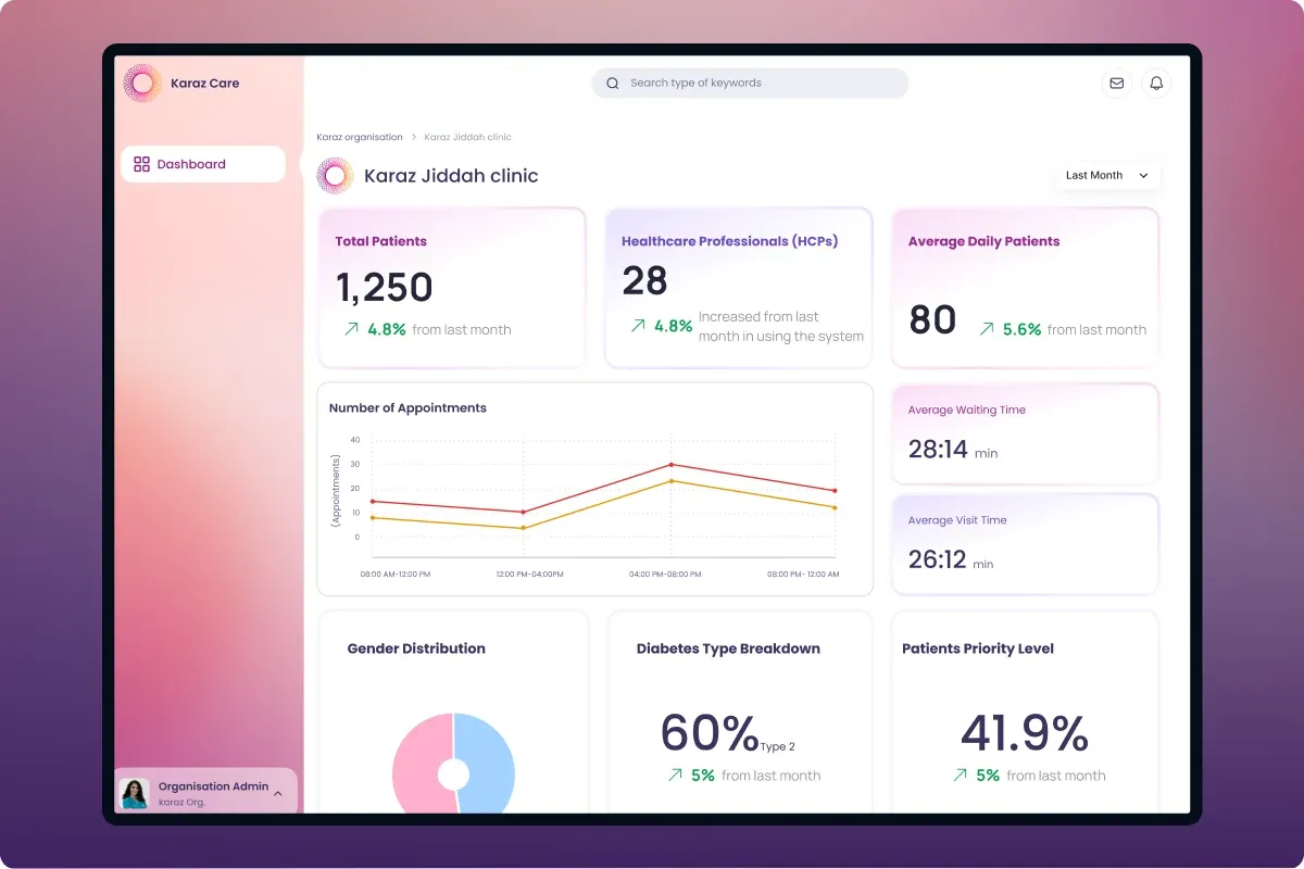
The Admin dashboard answers questions doctors do not need to think about. How many patients are active. Which devices are connected. Which clinical outcomes are improving. One long view, scrollable end to end, kept separate from clinical work so admins can see the clinic as a whole.

Admin — patient overview and connected devices summary at the top of the dashboard
Top of the dashboard. Patient overview (1,247 active, 187 high risk), connected device monitoring, and CGM brand mix.
Admin — Clinical & Glycemic Analytics with TIR, GMI, and control trends
Clinical and glycemic analytics. Time in range, GMI, and glycemic control trends across the clinic.
Admin — Clinical Glycemic Metrics with hypo/hyper events, GRI score, and variability
Clinical glycemic metrics. Hypo/hyperglycemic events, GRI score, and glucose variability — clinic-wide signals at a glance.
Admin — Reports, Attachments & Lab Tests dashboard
Reports, attachments, and lab tests. 1,038 uploads, 1,720 tests ordered, plus categorical and time-based distributions.
Admin — Medication & Logs Analytics with intervention flow and 8,547 logs
Medication and logs analytics. Intervention flow, comms volume, and 8,547 overall logs across insulin, meals, and meds.

DOCTOR

Triage risk, decide treatment, log interventions.

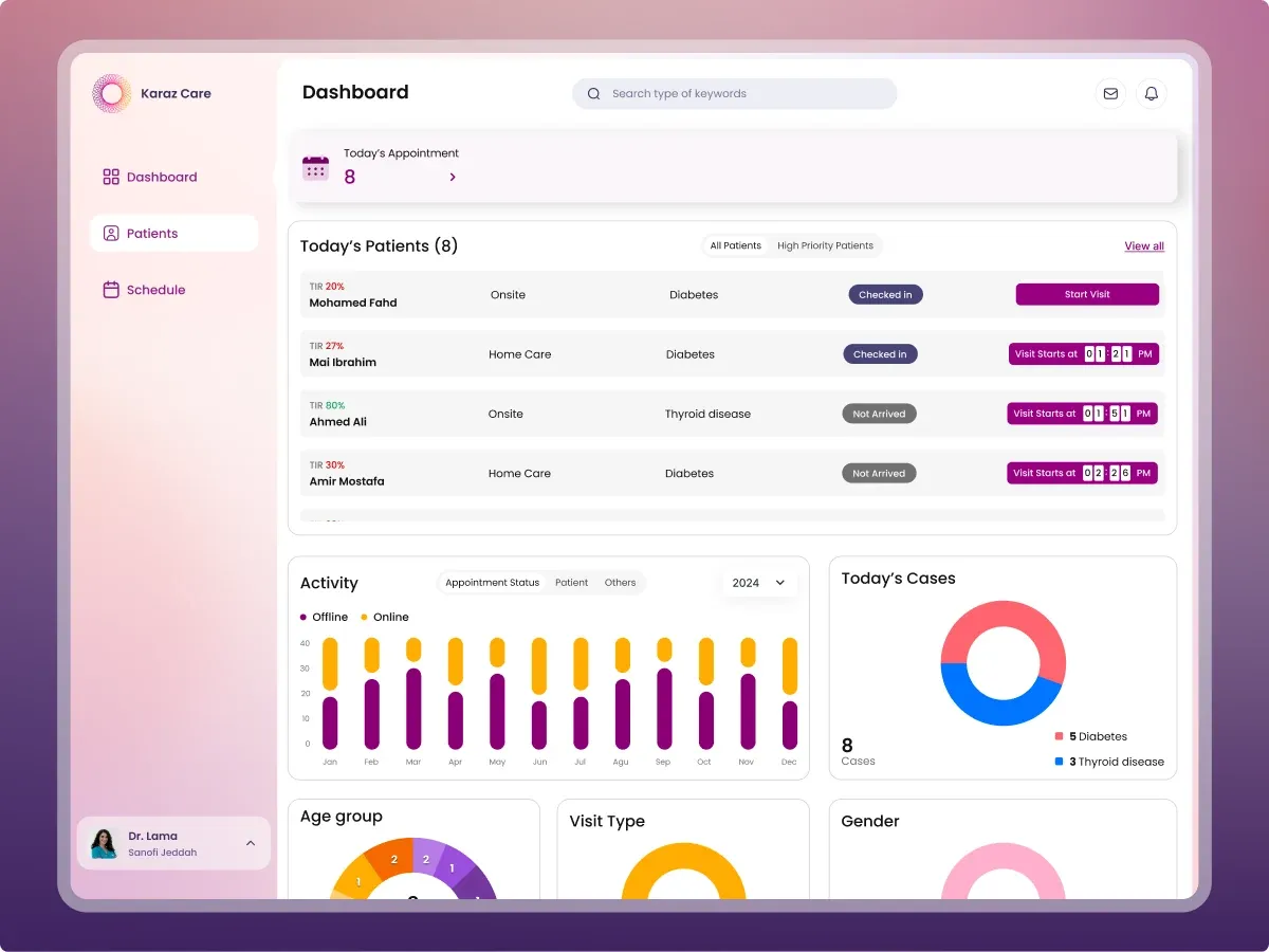
A doctor's day starts with the queue, not the database. The Doctor home opens with today's patient list — who is checked in, who is mid-visit, who is still waiting. From there, the doctor jumps to the full caseload, sorts by clinical risk, opens a single patient, and drills into Body Assessment, Medical History, and any attached report — all without leaving the page. Decisions, not data tours.

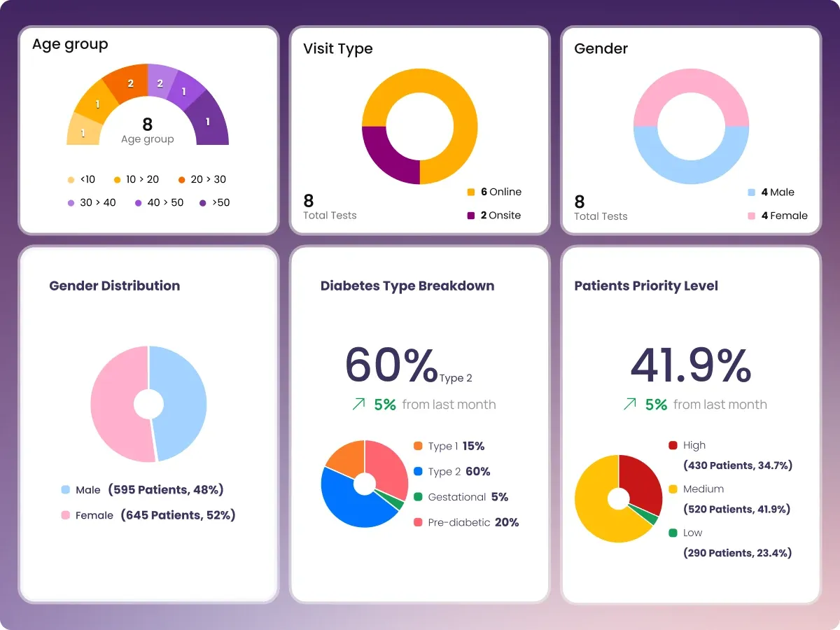
Doctor home dashboard. Today's appointment queue with eight patients, status badges, activity bar chart, today's cases by diagnosis, plus age, visit type, and gender breakdowns.
Doctor home. Today's patient queue at the top — checked-in, mid-visit, and waiting. Activity, today's cases, and demographics keep the day-level picture in view.
Doctor — full patient list with TIR, TBR, GMI columns, and high/medium/low risk badges
Full caseload. Each row carries TIR, TBR, GMI, and a priority badge. Sort once, triage 100+ patients in seconds.
Doctor — single patient overview opens with a high-risk banner spelling out the diagnosis and the CGM thresholds that triggered it
Open one patient. Risk reasoning at the top, then interventions, healthcare team, and medications — the order matches how the doctor decides.
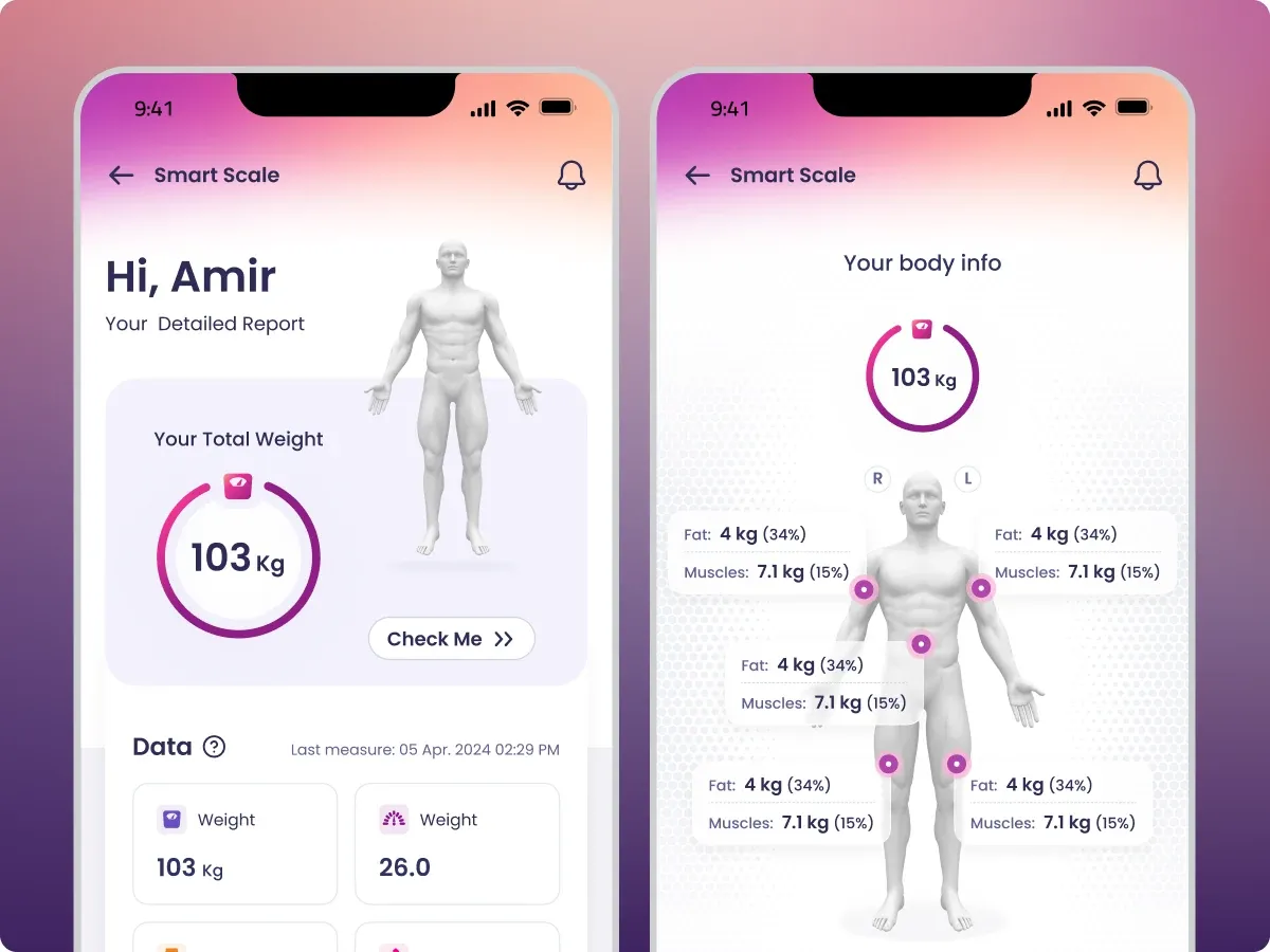
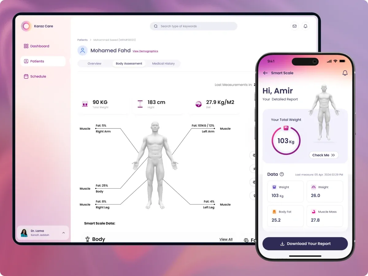
Doctor — Body Assessment tab with body diagram, weight and composition stats, and an Overweight indicator
Body Assessment tab. Visual composition view replaces flipping through weight, BMI, and fat numbers as separate fields.
Doctor — Medical History tab split into Tests, Attachments, Medication, and Previous Notes
Medical History tab. Tests, attachments, medication, and previous notes — split, not stacked, so the doctor jumps to the section they need.
Doctor — deeper in Medical History showing Intervention table, Referrals, and Insulin Logs
Below the fold of Medical History. Interventions, referrals, and insulin logs — separate tables for separate questions.
Doctor — Attachments view inside Medical History with an inline note preview popover
Attachments inside Medical History. Inline note preview lets the doctor scan eye exams, X-rays, and prescriptions without opening every file separately.

RECEPTIONIST

Waiting list, appointments, referrals.

Receptionists run the visit pipeline, not the clinical record. The dashboard splits the day into three blocks: today's overview at the top-left, the patient queue with appointment times and visit status, and the appointments calendar on the right. Visit details open inline so the desk can confirm or reschedule without leaving the page. No clinical data clutters the view — what they need, nothing they don't.

Receptionist dashboard. Today's overview with 45 total appointments, today's patients table with visit status badges, an April calendar, and a patient appointments side panel.
Receptionist home. Today's overview, the visit queue with status, and the appointment calendar — patient flow without exposing clinical data.

NURSE

Run intake. Triage, in order.

Nurses run the front of the visit. Today's patients in one list, with arrival state and triage state side by side. One screen, one job — start triage, mark done, move to the next.

Nurse dashboard — Today's Patients (13) with each row showing patient state and triage state
Today's patients. Arrival state and triage state side by side — one screen, one job.

PHARMACY

Process orders. Pending first.

Pharmacy staff need a different kind of patient list. Their portal opens with the order queue — Total Orders, Prescribed, Pending, and Rejected as headline counts, then the orders list filterable by status in one tap. Each row carries the patient, MRN, contact, insurance type, and the View action that opens the full prescription. Separate from clinical risk so the team is not buried in noise that does not concern them.

Pharmacy portal — Patient's Orders with stat cards, filter tabs, and an orders list with insurance type per row
Pharmacy portal. The day starts with the order queue — pending first, then prescribed, then rejected. Sorted for the next action, not the latest event.

INSIDE THE PATIENT OVERVIEW

ONE PATIENT, ONE RECORD, TOP TO BOTTOM.

The patient record is one long view, scrollable end to end. Daily activity and glucose readings sit near the top. Insulin distribution and risk scoring come next. Then connected devices, ending with the ambulatory glucose profile. Each section answers a different clinical question without making the doctor leave the patient.

Patient overview — Daily Patient Health Snapshot with exercise, sleep, and a 24-hour daily glucose reading line chart
Daily Patient Health Snapshot. Exercise, sleep, and a 24-hour glucose curve with checkmark events — the behavior layer behind the readings.
Patient overview over time — insulin distribution donut, hypo/hyperglycemic events by time of day, Glycemia Risk Index, and glucose overview
Patient overview over time. Insulin distribution, hypo/hyper events by time of day, the Glycemia Risk Index (GRI), and glucose averages — pattern, not a single point.
Patient overview — Devices section with last reading on Dexcom G6 and 14-day readings split across sensor brands
Devices. Last reading, plus a 14-day breakdown by sensor brand. Tells the doctor whether to trust the data or check the hardware first.
Patient overview — Ambulatory Glucose Profile with 14-day percentile bands and full time-in-range breakdown
Ambulatory Glucose Profile (AGP). The 14-day glucose curve with percentile bands and a full time-in-range breakdown — the chart most clinicians act on.

KEY DECISIONS

FIVE FORKS IN THE ROAD. FIVE CALLS I WOULD DEFEND.

01

FIVE ROLE-BASED DASHBOARDS INSTEAD OF ONE GENERIC VIEW

A receptionist managing waiting rooms and a clinician triaging risk see fundamentally different data. Forcing them into one dashboard hides what each role actually needs. I split the platform into five dashboards, each tuned to the decisions that role makes every day. Doctor sees risk. Receptionist sees waiting rooms. Admin sees clinic-wide stats. Pharmacy sees medication queues.

Built role-specific dashboards instead of one generic view. Each role solves different problems.

02

EIGHT QUICK ACTIONS HIDDEN BEHIND ONE FLOATING BUTTON

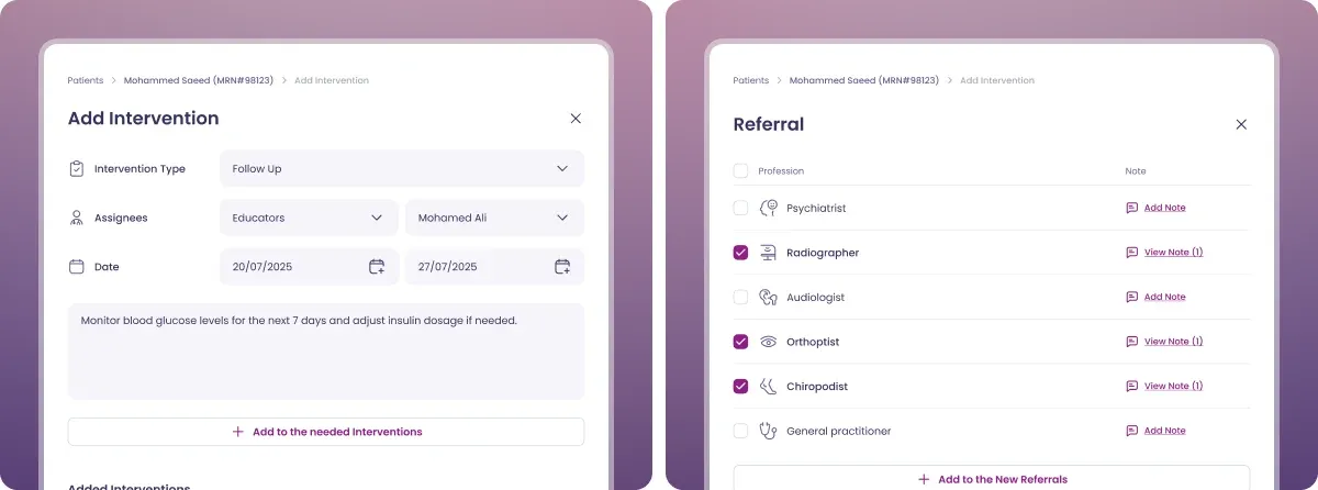
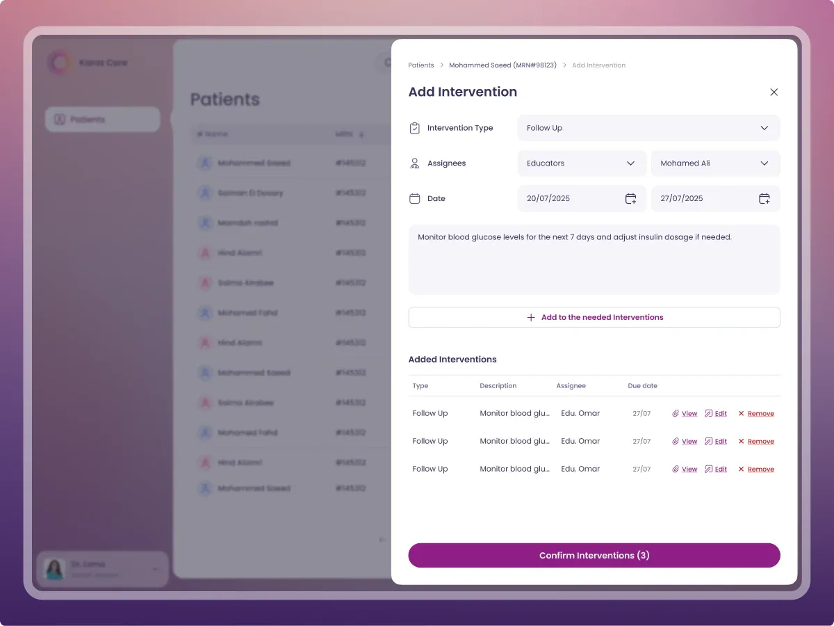
The Patient Overview needed eight quick actions — call, message, refer, add intervention, medicine, diagnosis, test, attachment. Putting eight buttons on the page would crowd the data, which is what clinicians actually came for. I tucked them into a single floating button that fans out on click. Actions are used a fraction as often as viewing the data, so they should occupy a fraction of the visual weight.

Patient overview with floating action button expanded showing 8 actions — call, message, refer, intervention, medicine, diagnosis, test, attachment
Call, message, refer, add intervention, medicine, diagnosis, test, attachment. All tucked behind one floating button.

Hid 8 actions behind one button. Viewing data matters more than triggering actions.

03

THREE TABS OVER ONE LONG SCROLLING PAGE

A clinician seeing 100+ patients a day does not read a record top to bottom. They jump to one section, scan, and move on. One long scrolling page forces back-and-forth that wastes seconds on every visit. Three tabs — Overview, Body Assessment, Medical History — match how the data is actually used.

Three tabs over one long scroll. Clinicians don't read top to bottom. They jump and scan.

04

WROTE THE REASONING INTO EVERY RISK FLAG

The High Risk banner could have just said "High Risk." Without context, it is just another dashboard the doctor has to interpret alone. Instead it reads in plain language: "This patient is Hypoglycemia because patient is Type 1 diabetic and has CGM metrics TIR ≥ 70 and TBR ≥ 3%." The why turns the screen from a data display into a decision tool.

Wrote the why into every risk flag. A flag without a reason is just noise.

05

PUSHED BACK ON DUMPING EVERY LAB RESULT ON THE OVERVIEW

The client and PM wanted every past lab result visible on the patient overview. I argued no. An overview that lists everything stops being an overview. We shipped recent results only, with a View All link to the full archive. The page kept its scanability, and clinicians could drill in when they actually needed history.

Pushed back on showing every past lab. An overview that lists everything stops being an overview.

THE DESIGN SYSTEM

ONE LIBRARY. EVERY SCREEN. EVERY ROLE.

Five dashboards across one product means five places where inconsistency would have shown up immediately. A unified design system — colors, typography, components, icons — kept the platform coherent through every release. Engineers shipped faster because the spec was explicit, and new screens stayed visually accountable to the rest of the product.

Figma design system file showing component library, form controls, calendar, charts, dashboard widgets, plus a full color palette
Full design system. Colors, typography, components, and icons used across the entire platform.

HOW I WORKED

RETAINER. DAILY STANDUPS. DIRECT LINE.

Model — Retainer. 4 months to v1, ongoing iteration after launch.

Communication — Daily standups on Slack. Direct line to the engineering lead and the client team.

Tools — Figma, ClickUp, Slack.

Research synthesis Information architecture User flows Wireframes Design system 5 role-based dashboards CRMS module Ongoing iteration

WHAT THIS MEANS FOR SIMILAR PROJECTS

Enterprise health tools fail when they treat all users as one. A receptionist, a pharmacist, and a doctor solve different problems. Designing for the role first, not the feature first, is what turns a database with a UI into software the team actually trusts.