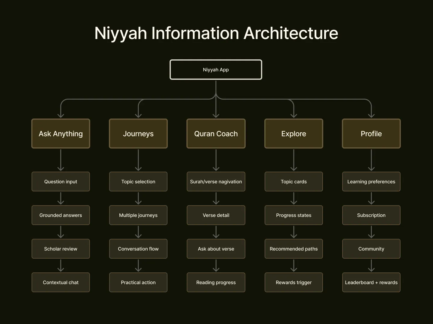
Information architecture
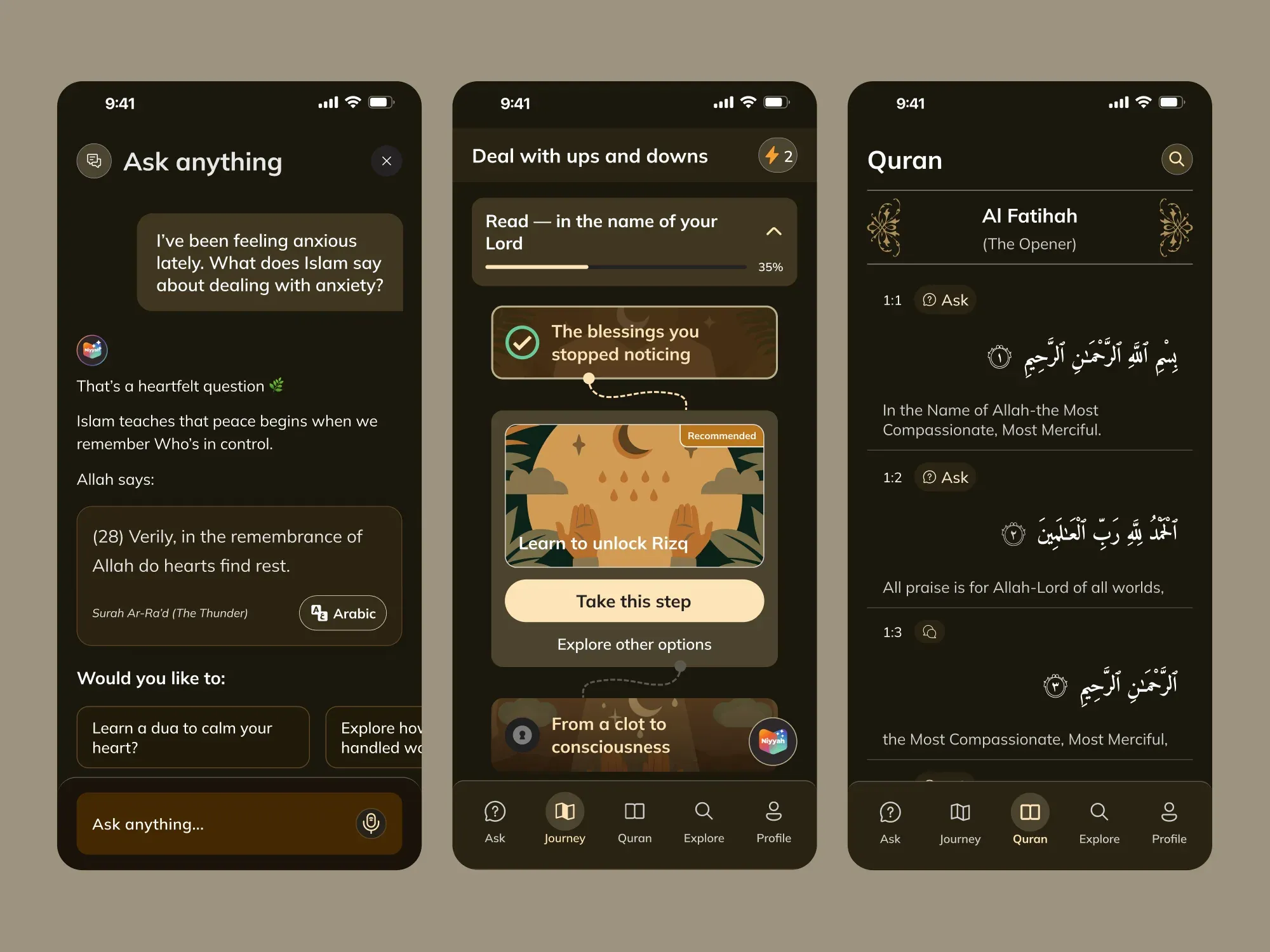
The Coach surface anchoring the app, with Quran, Explore, and the paywall as orbits.
The first two weeks were listening. I tried every Quran app on the store and talked to users. The same pattern showed up everywhere: too much content, no push, no reason to come back. Then I picked the spine: a chat surface where a real question gets a scholar’s answer. Build that right and the rest of the app could orbit it.
The evidence behind the decisions
I ran 30+ user interviews with a recruited panel of the core persona, discovery sessions to understand their habits and needs, and evaluative rounds to test shipped designs.
Post-launch, testing ran at up to two A/B tests per week, with a weekly team session analysing the Mixpanel data and documenting findings for the product team. That cadence is what moved activation from 62% to 86% in two months, with 69% of the beta cohort completing onboarding in their first session.
The killed feature. A planned generative AI chat feature was cut after testing showed users preferred curated, writer-authored paths. I redesigned it as a journey-based conversational content hierarchy, and that is what shipped. A decision reversed by evidence is the point of doing the research.
Problem I faced
Most Islamic learning apps are catalogues. Users open them, scroll, and close them. Niyyah needed to be a daily habit, credible enough for a religious product, casual enough to open before coffee.
Solution I proposed
A coach, not a catalogue. Every screen pushes one tap forward, one topic, one verse, one minute of practice. Scholar-backed, source-visible, no endless scrolling.
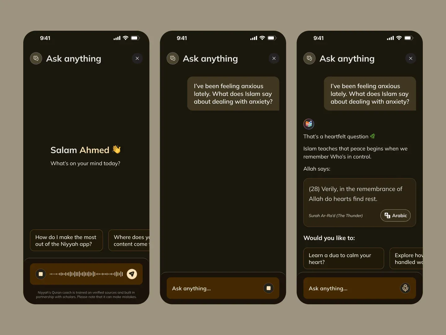
Sources live next to the answer.
A real question gets a scholar’s answer, with the verse it traces from sitting right beside it. Tone was the design problem, not layout: plain language, sources in view.
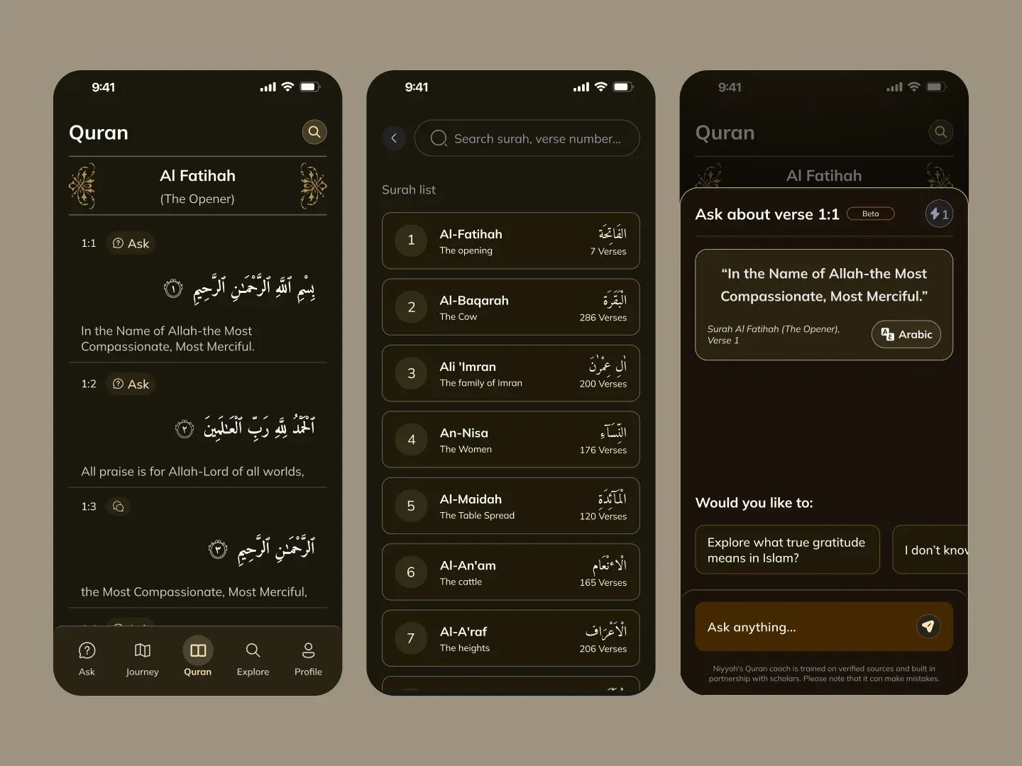
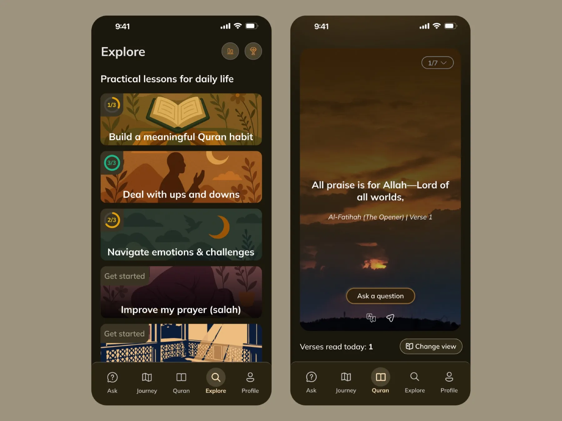
One screen, two readers.
Arabic-first with translation in peripheral vision, or translation-first with Arabic for reference. One layout, no toggle. Fifteen versions before both felt native on a commute.
Topics, not lectures.
Lists of lectures drown a new user. Topic cards are sized to one sitting, and the next-best topic always sits at the bottom of the current one.
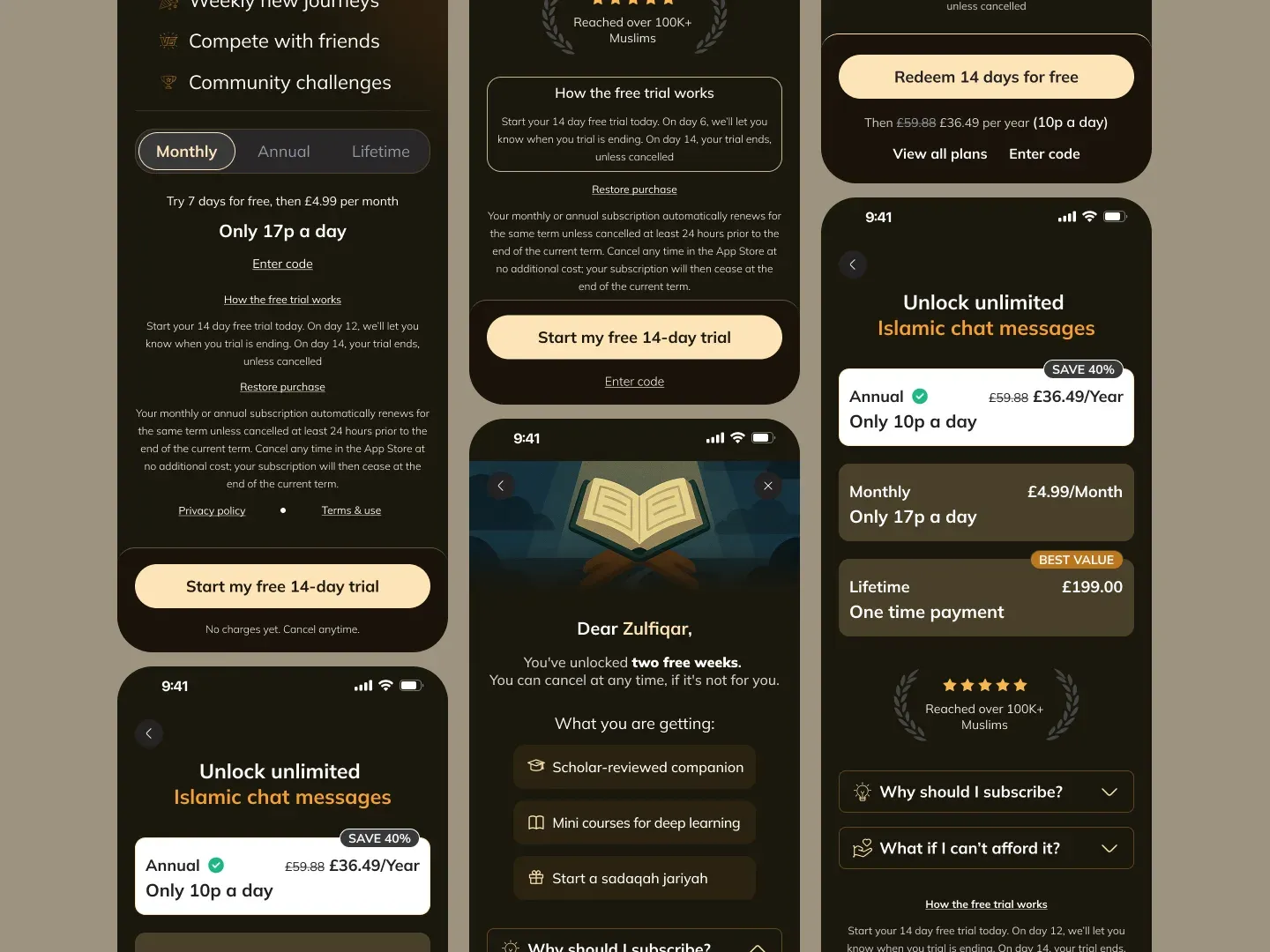
Trust converts better than scarcity.
Three value lines, then the price, then the alternatives. No countdown timers, no urgency tricks. The paywall had to sit right beside a religious product.
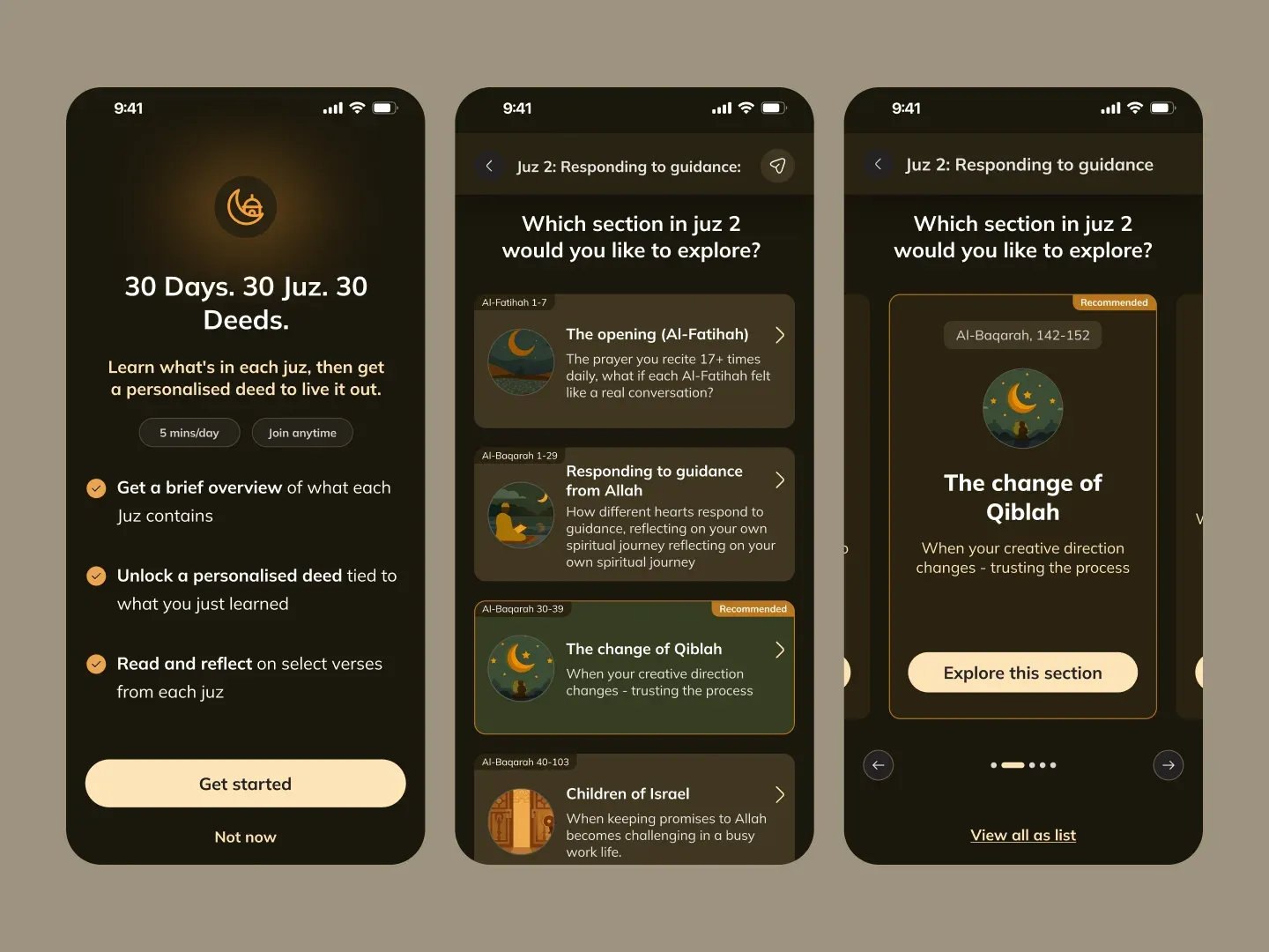
One primitive, dressed for every season
Ramadan is the catalogue’s busiest moment of the year. The same Topic primitive carries the campaign, so the product stays consistent while the season changes around it.
Head of Design, end to end
Model, Head of Design, dedicated long-term contract. V1 shipped in one month; ongoing through 80+ iterations.
Communication, Daily sync with the founder. Weekly engineering review.
Tools, Figma, FigJam, Notion, TestFlight, Loom.
-
IA across Coach, Quran, Explore + account flows
-
Design system for iOS and Android
-
50+ shipped screens · 80+ iterations
-
App Store & Google Play assets
-
Engineering handoff & design QA
-
Seasonal Ramadan campaign design
Pick whether you’re a catalogue or a coach. Catalogues let users browse. Coaches push them through. Most apps in this category never make that choice, and the retention curves show it.
What comes next
-
Add streak rewards that survive a missed day. Long-term habits don’t break on a single skip.
-
Push the Coach voice into Arabic. Right now it leans English.
-
Test a quiet community layer. Not a feed, a small circle of accountability partners.